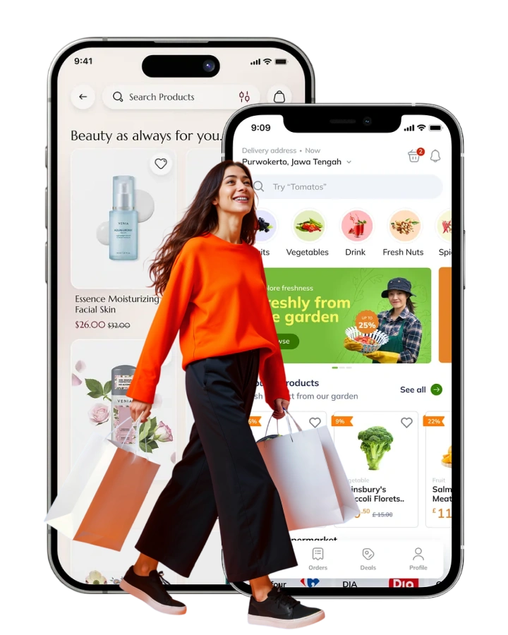
Organic freshness, delivered in minutes
Freshee is a Jabalpur-born quick-commerce brand on a simple promise — 100% certified-organic vegetables, fruits, fresh juices and daily essentials, at your doorstep in minutes. BoostronixX shaped the brand identity, the iOS and Android app experience and the D2C storefront so ordering fresh feels as effortless as the tagline: freshness at your fingertips.
Client
Freshee
Category
D2C · Quick Commerce
Engagement
Brand · App UI/UX · Storefront
Year & Location
2025 · Jabalpur, MP
The challenge
Make “100% organic” feel effortless to buy
Organic grocery is a trust purchase; quick commerce is a speed purchase — Freshee had to be both at once. It needed an identity that signalled genuinely organic without cliché, plus an app and storefront where a busy family goes from craving to checkout in under a minute, seamlessly across iOS, Android and web.
Prove the organic promise
Make certified 100% organic and sustainable packaging a felt guarantee, not just a badge.
Design for minutes
A quick-commerce flow where discovery, cart and checkout stay fast, light and thumb-friendly.
One brand, three surfaces
A consistent look and feel spanning the iOS app, Android app and the freshee.shop storefront.
Win family trust
A warm, health-first tone that reassures parents shopping for the whole household.
Our approach
A fresh, organic system built to move fast
We started with the brand — living greens, natural produce cues and a friendly, health-forward voice — then built a single design system so every screen feels like one Freshee. Component-first thinking meant the same product cards, category chips and cart patterns flow cleanly from app to storefront.
Brand identity & board
Logo, organic green palette, produce-led illustration and a clear voice built around freshness.
Reusable design system
Product cards, category chips, cart and checkout components consistent on every surface.
Mapped shopping journeys
Streamlined flows from browse to reorder, cutting steps so ordering feels genuinely quick.
Sustainability, made visible
Design cues that surface organic certification and sustainable packaging where they build trust.
Key features
An app and storefront made to reorder
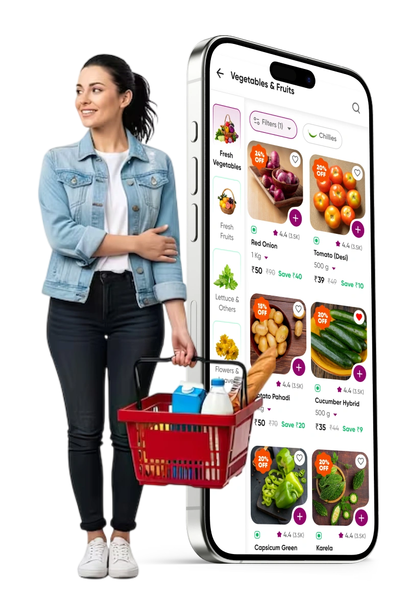
Built around the moments that matter in grocery — finding what you need, trusting it's fresh, and getting it fast. Clear browsing, prominent freshness cues, a frictionless cart and an easy reorder path make a weekly shop take moments.
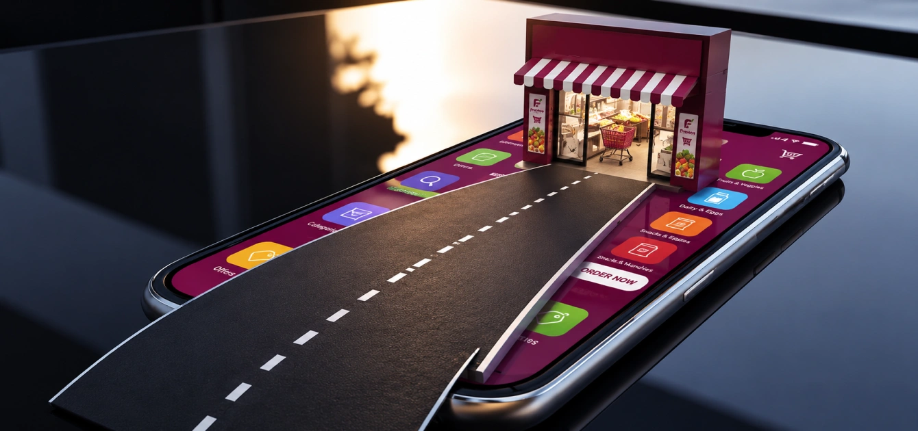
The showcase
Freshee, from splash screen to storefront
Across the brand board, app screens and the D2C storefront, the system holds together — living greens, generous produce imagery and a calm layout that lets the food be the hero.
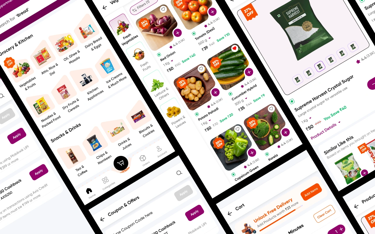
App UI · home, category, product & cart screens
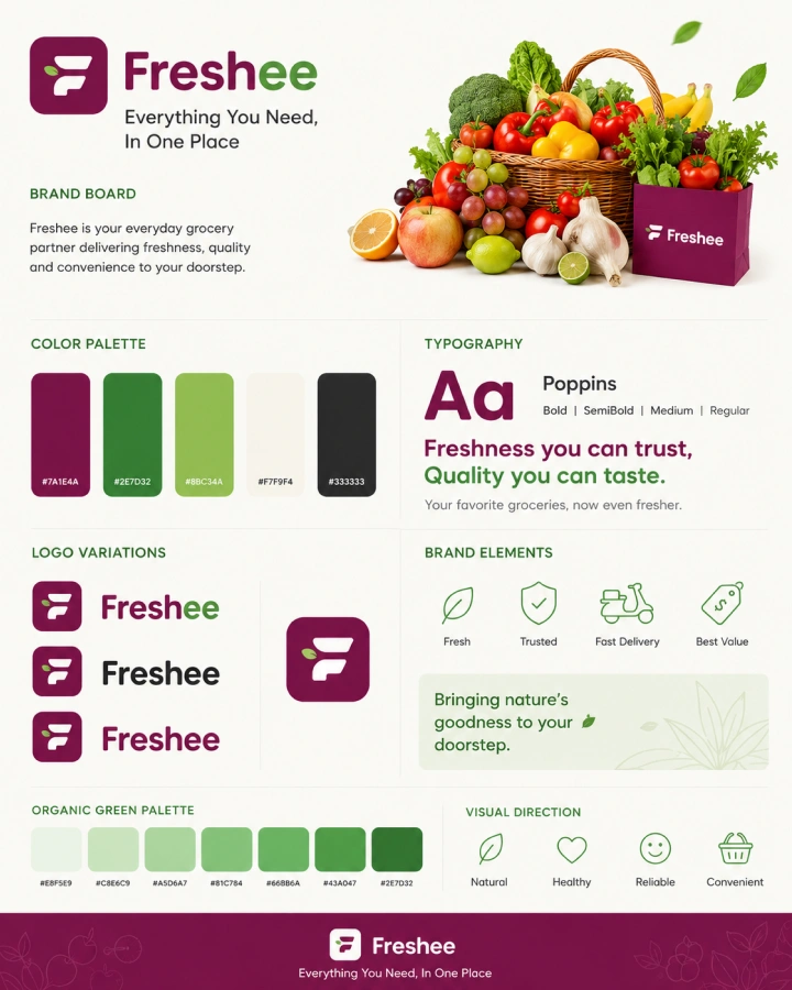
Brand board · logo, palette & type
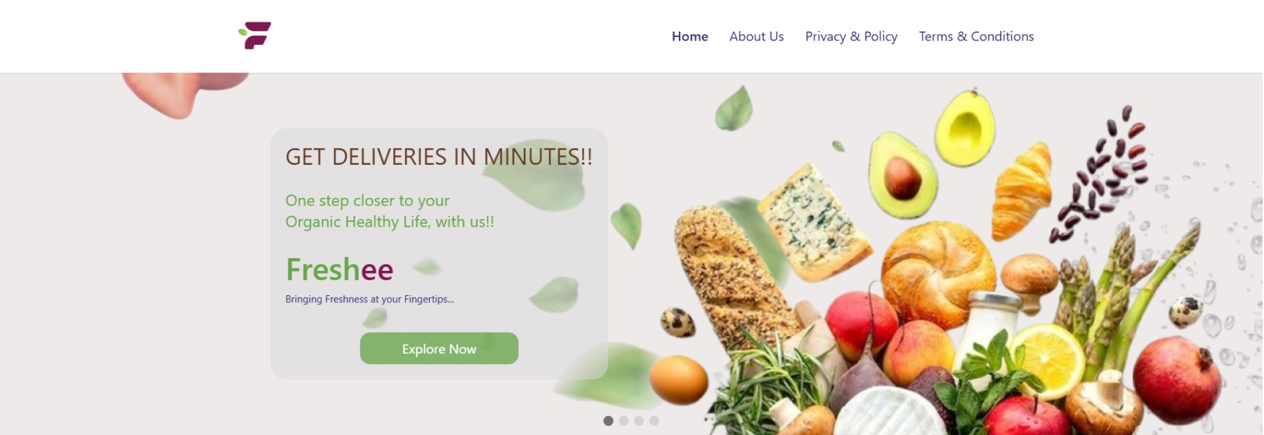
D2C storefront · responsive freshee.shop layout that mirrors the app
The outcome
A brand as fresh as what it sells
A brand customers trust
A cohesive organic identity that makes the 100%-organic, sustainable promise feel real at a glance.
Fast to shop
Browsing, cart and checkout flows designed so ordering fresh groceries feels quick and effortless.
Consistent app & web
One design system carried cleanly across iOS, Android and freshee.shop — never stitched together.
Built for repeat
An easy reorder path and familiar patterns designed to turn a first order into a weekly habit.
“We wanted ordering organic to feel as fresh and effortless as the food itself — so the brand, app and storefront finally speak with one voice.”
— BoostronixX · Brand & Product Design team
D2C · Quick commerce · E-commerce
Building a D2C brand or grocery app?
Let's shape the brand, the app and the storefront together — one system, built to convert and easy to grow.